What a B2B Website Needs on the Page Where Buyers Decide
B2B buyers arrive already researched and leave in seconds when a site cannot say who it is for. Six elements decide whether they enquire or close the tab.
They arrive knowing more than you think
By the time a B2B buyer reaches your site they have usually asked a peer, read a comparison, and possibly asked an AI assistant. They are not there to be introduced. They are there to check whether you are credible and whether you are for them.
That changes what the page has to do. It is a qualification tool, not a brochure.
The six elements that decide it
1. A headline that names the buyer and the outcome. Not "innovative solutions for modern business". Who it is for, what changes, in plain words. If a stranger cannot repeat what you do after five seconds, nothing else on the page matters. This is the first leak in why websites fail to generate leads.
2. Proof that survives scrutiny. Named clients, real numbers, work you can point at. One specific result beats ten logos with no story. Anonymous testimonials read as invented, because most are.
3. An honest answer about price. B2B sites hide pricing by reflex, and buyers experience it as evasion. You do not need a price list. You need a range, a starting point, or an explanation of what drives the number, as we do in our own cost breakdown. It disqualifies the wrong buyers before they consume a sales call, which is the point.
4. Evidence you have done this before, for them. Sector, size, or situation. Buyers are looking for themselves on the page. Generic sites make every visitor do that translation work, and most will not bother.
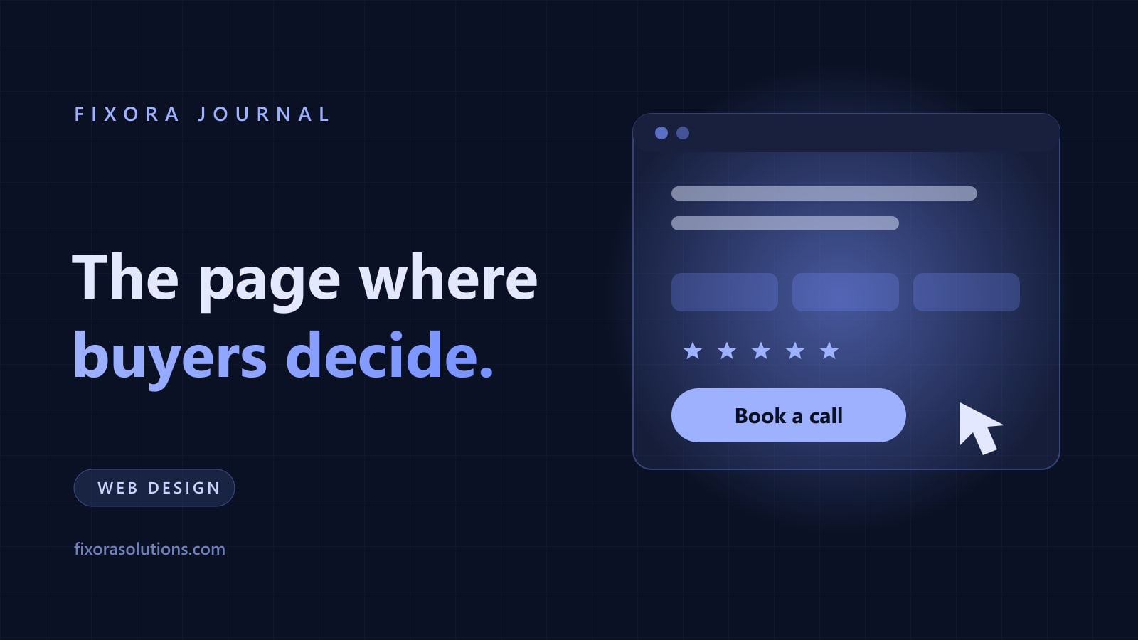
5. One action, repeated. Book a call, or request a quote, or start a trial. Not all three. Competing calls to action split the decision and reduce all of them.
6. A short form. Every field costs conversions. Name, email, and one open question is enough to start a conversation. You can qualify in the reply. Long forms are how sites collect fewer, not better, leads.
What buyers check that you are not thinking about
Whether the site works on their phone, because a large share of first visits happen there. Whether it loads before they lose interest, which is measurable and expensive, per the speed and sales data. Whether anyone is home: a blog whose last post is two years old signals a business that may not answer.
They also check you the way they check any supplier: your LinkedIn, your reviews, whether a real person's name appears anywhere. A site with no human on it converts worse than one with a photo and a name, which is the same effect behind founder led content.
The follow up is part of the website
The best converting site in the world loses to a competitor who replies faster. Enquiries decay in minutes, not days, and the evidence behind that is in the five minute rule. Wire the form to a notification someone actually sees, and have a first reply ready to send.
What to fix first
Rewrite the headline and subheading to name the buyer and the outcome. Add one real proof point with a number. Cut the form to three fields. Add a price range or the logic behind pricing. Make the enquiry notify a phone.
That is usually a day of work and it outperforms a rebuild, which is worth confirming before anyone sells you one, per the redesign signals.
Frequently asked
Should we gate a case study? Rarely. A gated case study mostly prevents the buyer from becoming convinced.
Do we need a chatbot? Only if it answers fast and hands to a human cleanly. The evidence is in the chatbot guide.
Can Fixora audit our site? Yes. We review the page against these six, show where enquiries are lost, and quote only what moves the number. Send us the URL and get findings within 48 hours.
Have a project that needs this?
Tell us what you are building. We reply within 24 hours.
The service behind this
Graphic Design
Design that holds up at 16 pixels and across every asset after it. Built as a system your team can actually use without coming back to us for every social post.