Pricing Page Psychology: What the Research Actually Supports
Anchoring, decoys, and the paradox of choice are real, replicated effects. Most pricing pages use none of them, and the ones that do usually copy the trick without the mechanism.
Price is read, not calculated
Buyers do not evaluate a price against some internal ledger of true worth. They evaluate it against the other numbers on the page. That single fact, established across decades of behavioural research, is why the arrangement of a pricing page changes revenue without anything about the product changing.
Three effects have survived enough replication to design around.
1. Anchoring
Tversky and Kahneman showed that an initial number pulls subsequent judgments toward it, even when the anchor is obviously arbitrary. On a pricing page, the first or highest number sets the frame every other option is judged against.
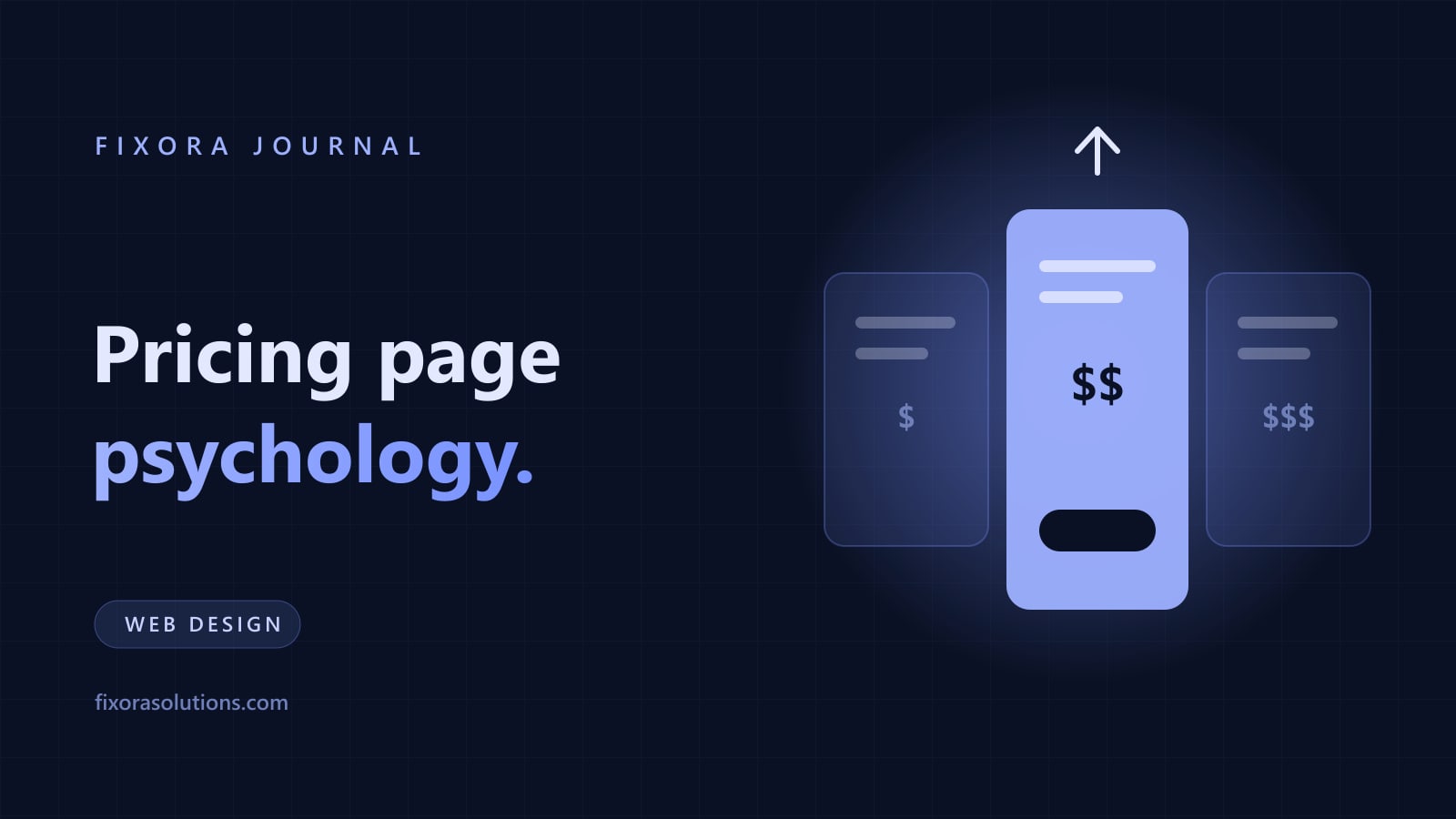
Practically: showing your premium tier first or most prominently makes the middle tier feel measured rather than expensive. Removing the high anchor makes the same middle price feel like the top of your range, which is a worse place for it to sit.
For a service business without tiers, the anchor is whatever number you say first. If a scope conversation opens at your smallest project, everything after it feels like an escalation.
2. The decoy effect
Add a third option that is clearly worse than one of the existing two, and preference shifts toward the option it makes look good. Dan Ariely's demonstration with magazine subscriptions is the famous version: adding a print only option nobody chose made the print and digital bundle dramatically more popular.
The honest use is real: if you genuinely offer three tiers and one exists mainly to clarify the value of another, that is presentation, not deception. The dishonest use is inventing an option you will not actually sell.
3. Choice overload
Iyengar and Lepper's jam study found that a display of 24 varieties attracted more interest but produced far fewer purchases than a display of six. More options, less action.
Later work has narrowed when this applies, but the practical lesson for pricing pages holds: three tiers usually outperform six. Every additional option adds a decision, and decisions are where people leave. This is the same friction principle behind cutting form fields.
The effect nobody uses: just answer the question
For service businesses, the highest impact pricing decision is not arrangement. It is whether a number appears at all.
Hiding price entirely is read as evasion, and it forces the buyer to spend a sales call finding out something they could have learned in four seconds. Given that buying groups give suppliers only 17% of their time, spending that scarce attention on a qualification call is expensive for both sides.
You do not need a price list. A range, a starting point, or the logic that drives the number is enough, which is why we publish ours. It disqualifies the wrong buyers before they cost anyone a meeting, and it reads as confidence.
The line we do not cross
Everything above works by helping a buyer judge value in context. There is an adjacent set of tactics that works by making them decide badly: countdown timers that reset, "only 2 left" on unlimited inventory, fabricated recent purchase popups, and prices that appear discounted from a number never charged.
These lift conversions in the short term and are consumer protection problems in several markets. They also poison the thing you actually need, which is trust that survives the buyer telling a colleague. We do not build them, and we say so when asked.
Frequently asked
Should we show price if we are expensive? Especially then. Price hiding does not stop the objection, it delays it to the moment it is most expensive to handle.
How many tiers? Three for most businesses. One clear recommendation among them.
Can Fixora rework our pricing page? Yes: structure, anchoring, and copy, with nothing on it that we would be embarrassed to explain to your customer. Send us the page and get findings within 48 hours.
Have a project that needs this?
Tell us what you are building. We reply within 24 hours.
The service behind this
Graphic Design
Design that holds up at 16 pixels and across every asset after it. Built as a system your team can actually use without coming back to us for every social post.