Pitch Deck Design: You Get About Two Minutes. Use Them Well.
Investors spend around two to three minutes on a deck before deciding whether to keep reading. What that means for design, order, and the slides that matter.
The two minute reality
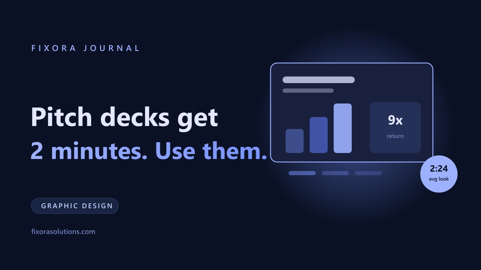
DocSend's long running analysis of thousands of fundraising decks keeps landing on the same uncomfortable number: investors spend roughly two to three minutes on an initial deck read, and the trend has been falling for years. Your deck is not a document that gets studied. It is a skim that either earns a meeting or does not.
Design for the skim and you win twice: the two minute reader gets the story, and the rare deep reader finds the substance underneath. The same first impression research that governs websites governs decks: judgment forms in milliseconds and everything after passes through it.
The slides that actually get read
Attention analysis consistently shows the heaviest time on a handful of slides: the problem, the solution, the traction, the team, and anything with numbers. Which produces the working order:
- One line of what you do, in words a stranger repeats correctly afterward.
- The problem, framed as money or time someone measurably loses today.
- The solution, shown not described. A product image beats a paragraph every time.
- Traction, the slide that gets the longest stare. Real numbers, honest axes, no cumulative chart tricks. Investors read charts for a living and mentally discount decorated ones.
- Market, model, team, ask. One slide each, and the team slide needs faces, not logos.
Ten to fourteen slides. Every extra slide dilutes the two minutes.
Design rules that survive a skim
- One idea per slide. If a slide needs a paragraph, it is two slides or zero.
- 30 point font minimum for body text. This is a discipline device: it makes overcrowding physically impossible.
- A real system, not decoration. Same type, colors, and chart style throughout, on brand with your site, because the investor will open both within the same five minutes. Coherence reads as competence, per the design revenue evidence.
- Charts stripped bare. One highlighted series, one takeaway per chart, labeled directly instead of with legends.
- Readable on a phone. A large share of first reads happen on mobile between meetings. Zoom your deck to a third of its size; if a slide dies, fix it.
The mistakes that kill good businesses
The deck failures we see are rarely aesthetic. They are narrative: burying traction on slide eleven, ten slides of market before one of product, jargon that forces rereading, and the classic: a beautiful deck wrapped around no clear ask. Design cannot rescue a missing story; it can only make a clear story land faster.
The same skills apply beyond fundraising: sales decks and proposal documents live under identical two minute physics, which is why deck systems are part of our design services.
Frequently asked
Should I hire a designer or use a template? Template for the v1 you iterate weekly. Professional system when real money is on the line and the deck must match the brand investors will check five minutes later.
How long does a professional deck take? Two to three weeks including the story work, which is most of the value. Design that starts before the narrative is decoration.
Can Fixora build ours? Yes: narrative, design system, charts, and both send and present versions. Send us your current deck and get a fixed scope quote within 48 hours.
Have a project that needs this?
Tell us what you are building. We reply within 24 hours.
The service behind this
Graphic Design
Design that holds up at 16 pixels and across every asset after it. Built as a system your team can actually use without coming back to us for every social post.