The Product Page Is the Whole Shop
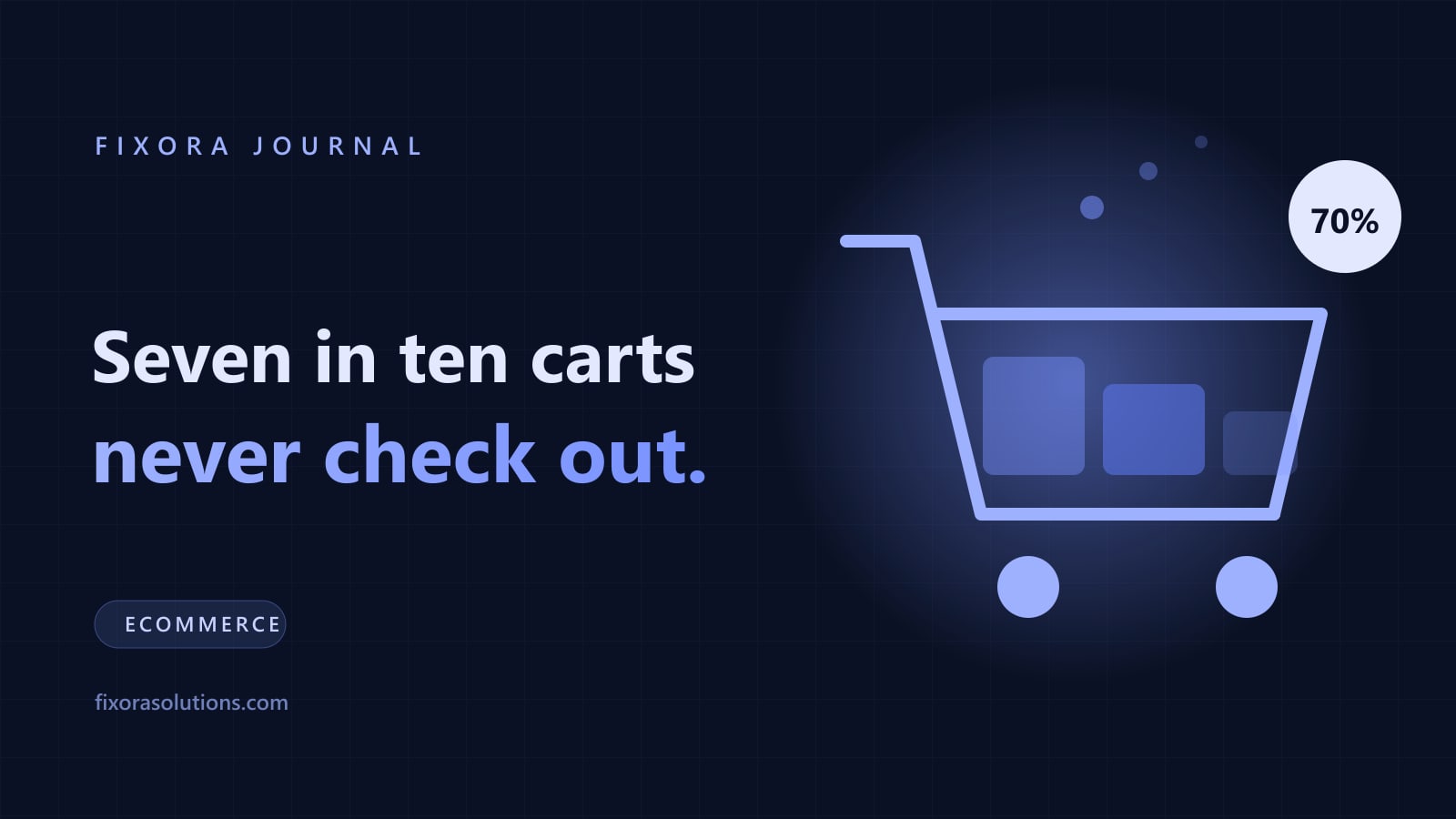
Baymard's meta-analysis of 50 studies puts average cart abandonment at 70.22%, and its testing suggests better checkout design could lift conversion by 35%. Most of that decision is made earlier, on the product page.

Where the decision is actually made
Cart abandonment gets all the attention. Baymard's meta-analysis of 50 studies puts the documented average at 70.22%, and its own testing suggests a well-designed checkout could raise conversion by around 35%.
Both figures are real and both are downstream. By the time someone reaches the cart, the decision to want the thing has already happened. The product page is where that happens, and it is the page most small stores treat as a template to be filled rather than a page to be written.
A physical shop has a person who answers questions. Your product page is that person, working alone, with no ability to hear the question.
The questions the page has to answer without being asked
Every abandoned product page is an unanswered question. There are about eight, and they are the same eight everywhere.
What is it, exactly? Dimensions, materials, weight, what is in the box, what is not. Specification vagueness reads as evasion.
What does it look like in real life? Not just on white. In use, at scale, next to something familiar, from the angles a buyer would turn it to see.
Will it fit me, or my space, or my setup? Sizing that admits its own quirks ("runs small, size up") converts better and gets returned less.
What will it cost, delivered? Unexpected shipping cost at checkout is the most-cited abandonment reason in Baymard's research. Putting the number on the product page loses you a few clicks and saves you the ones that were going to abandon anyway, for the same reason publishing prices works.
When will it arrive? A date beats a promise. "Order by 2pm, arrives Thursday" is a different sentence to "fast dispatch".
What if it is wrong? Returns policy linked at the point of decision, in plain language, not buried in the footer.
Has anyone else bought it? Reviews on the page, unedited, including the mediocre ones. A wall of five stars reads as fabricated, and the trust research is consistent on this.
Who are you? A real business with a real address and a way to reach a human.
The three failures we see most
Manufacturer copy, pasted. The same paragraph appears on forty other stores. It answers none of the questions above, and it gives search engines no reason to prefer your page.
Not enough images. One hero shot and a spec table. The most common cause is that photography feels expensive, so it never gets scheduled. A phone, daylight, and a plain wall beats a stock render.
A mobile page that buries the price and the button. Most traffic is mobile, most abandonment is mobile. Open your own product page on a phone, in daylight, on a mediocre connection. If price, delivery, and the add-to-cart control are not reachable in the first two thumb movements, that is the fix before all others, along with the page weight slowing it down.
The order to fix them in
- Photograph everything properly. Six to eight images per product: front, back, detail, in use, in scale, and one that shows the thing people will complain about if they cannot see it.
- Rewrite the top 20 products by traffic. Answer the eight questions in your own words. Leave the long tail on template copy until these are done.
- Put delivery cost and date above the fold. Even approximate is better than absent.
- Move reviews onto the page and stop filtering them.
- Add the specification table with the dull numbers in it. The dull numbers are what a serious buyer came for.
- Then fix the checkout, where Baymard's 35% lives, and only then start the recovery email flow for the people you still lose.
That order matters. Recovery emails for people who abandoned because the page never told them the shipping cost are an expensive way to apologise for a fixable problem, and the first 90 days of a new store are too short to spend on the wrong end of the funnel.
Frequently asked
How many images is too many? We have never seen a store lose money by adding a useful photograph. Compress them properly and add real alt text.
Should we use AI-generated product imagery? For lifestyle context and backgrounds, carefully. For the product itself, no. Buyers notice, and returns follow when the item does not match the render.
Can Fixora rework our product pages? Yes: a template that answers the eight questions, the photography brief, and the top 20 products rewritten. Send us the store and get the audit within 48 hours.
Have a project that needs this?
Tell us what you are building. We reply within 24 hours.
The service behind this
AI Marketing Services
A full marketing function without the headcount: strategy, content, campaigns, and outbound, run as one system and reported on the numbers that decide whether it paid.