A Logo That Hides a Connector Inside the Name
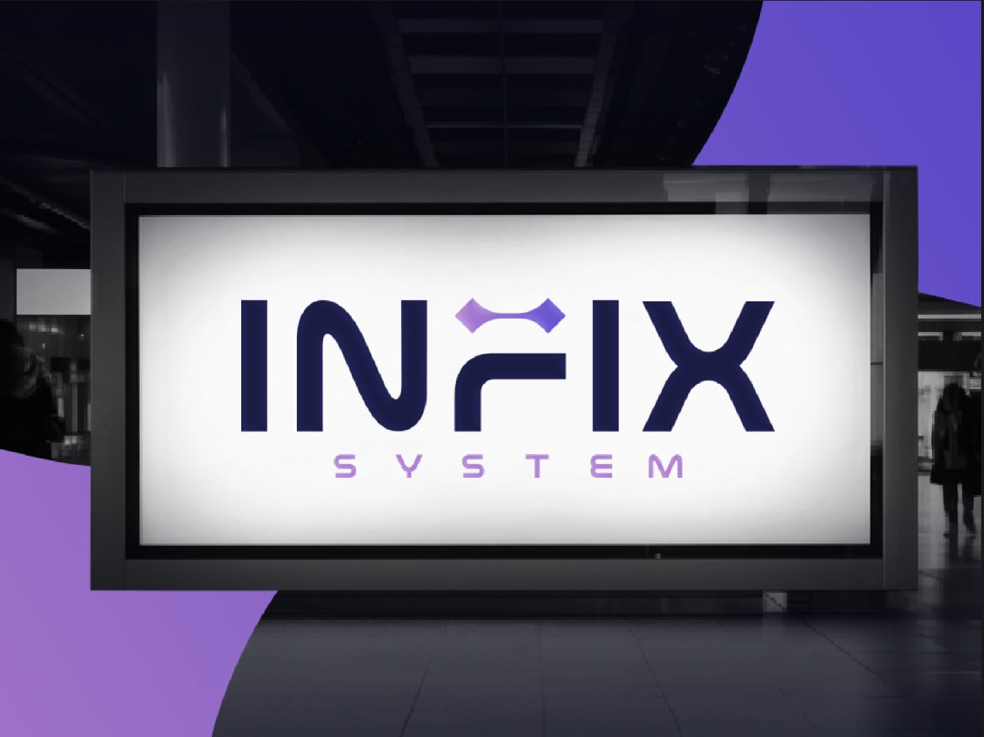
Server infrastructure is invisible until it breaks, which leaves the brand doing all the talking. The mark puts a network connector where the crossbar of the F should be.
- Client
- Infix System
- Sector
- Digital services and server infrastructure
- Discipline
- Graphic design
The brief
Infix System sells digital services, server management, and infrastructure. The work is invisible by design: when it is done well nothing happens, and nobody notices the thing they are paying for. That leaves the brand carrying an unusually heavy load, because it is the only part of the service a prospect can actually see before they buy.
The category is also visually exhausted. Search any hosting or managed services competitor and you get the same blue, the same circuit board, the same abstract swoosh. Being memorable here does not require being loud. It requires not being the fourth identical blue logo in a procurement shortlist.
The decisions
- 01
Put the idea inside the name
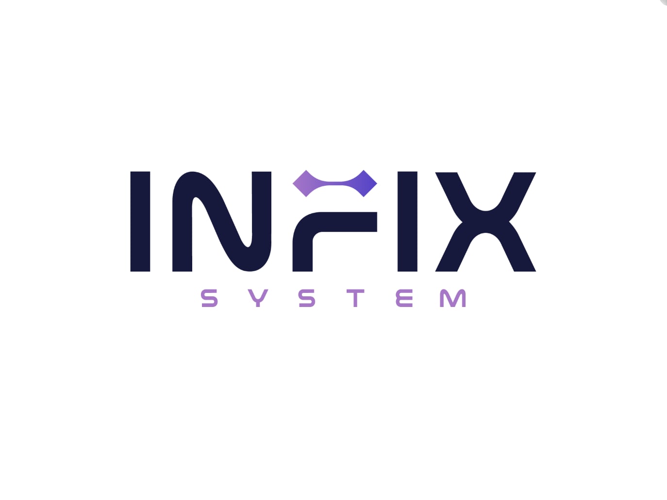
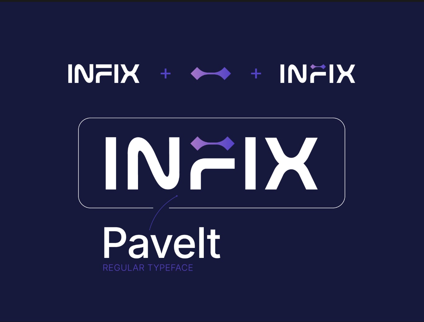
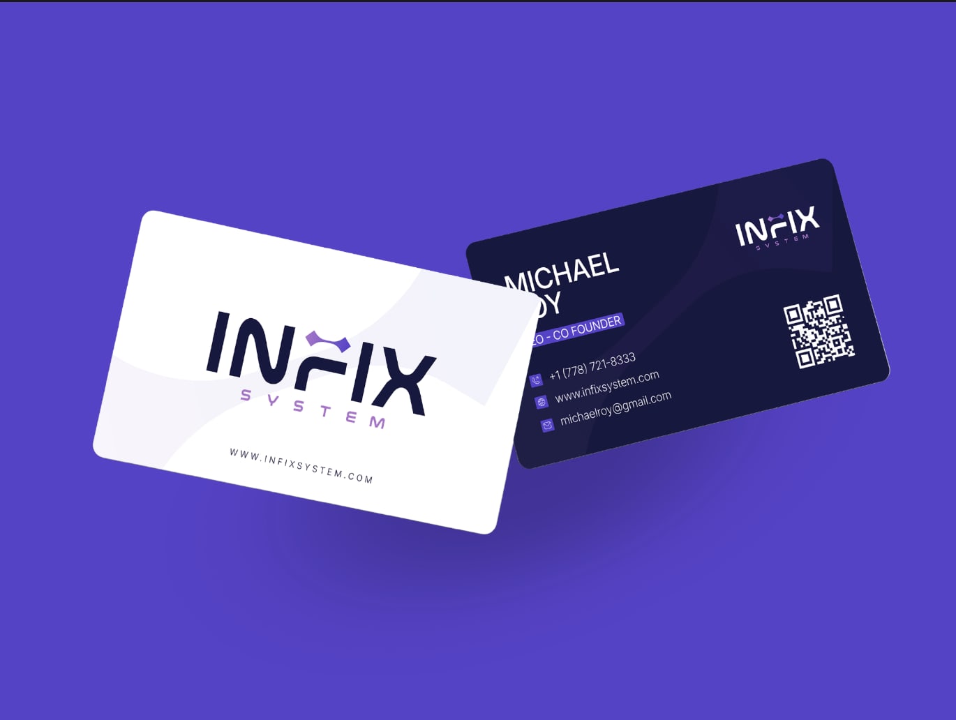
The crossbar of the F is replaced by a two node connector, so the wordmark reads INFIX and shows a link between systems at the same time. A separate icon sitting next to a wordmark is two things to remember; this is one.
- 02
Indigo, not the category's blue
A deep navy base (#131a3d) with indigo (#4a4dc9) and a lighter violet (#a379c9) running as a gradient through the connector. Close enough to the technical register to be credible, far enough from default blue to be told apart in a list of suppliers.
- 03
PaveIt for the mark, Inter for everything else
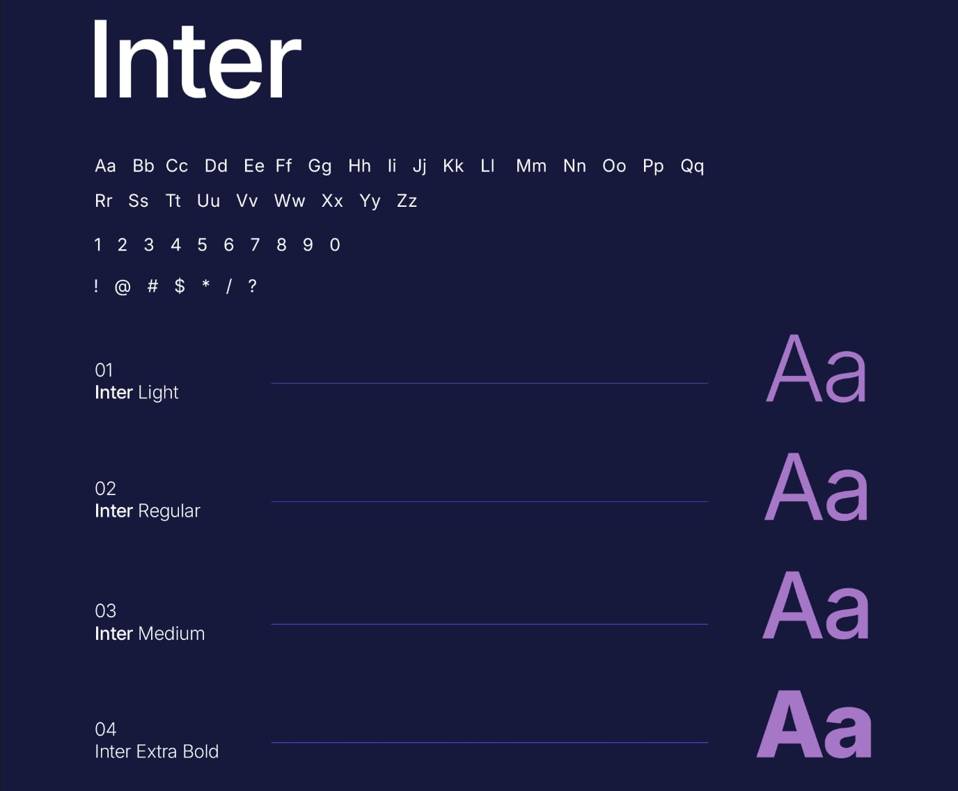
The logotype is set in PaveIt, geometric and slightly engineered. Everything else runs on Inter across four weights. Inter is a screen typeface, and every surface this company owns is a screen.
- 04
Designed at both extremes first
The connector element was tested as a rounded app icon and as backlit signage before anything else was drawn. A mark that only works at presentation size is a mark that fails on the favicon, which is where most people will actually meet it.
- 05
Proved on things people hold
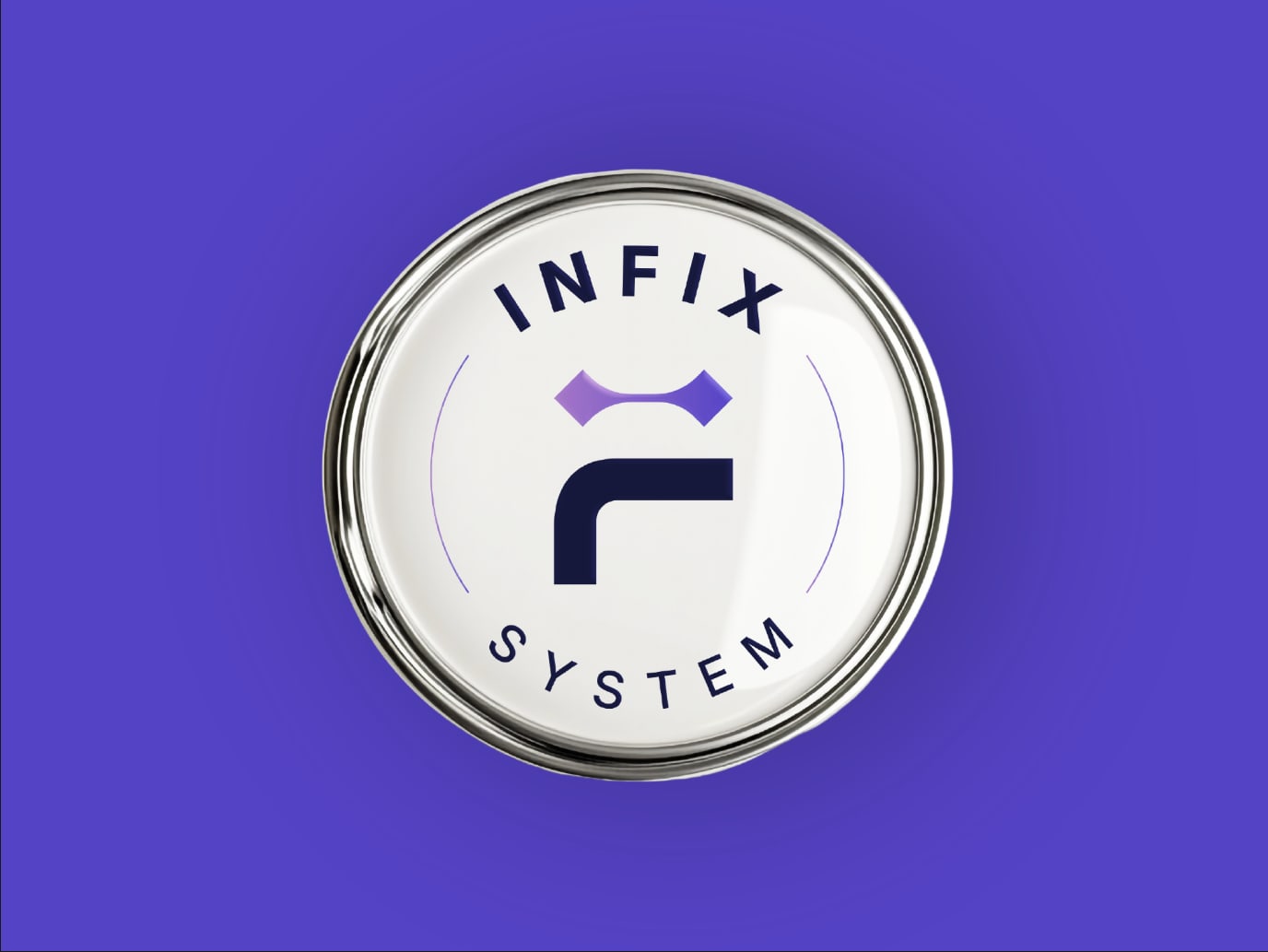
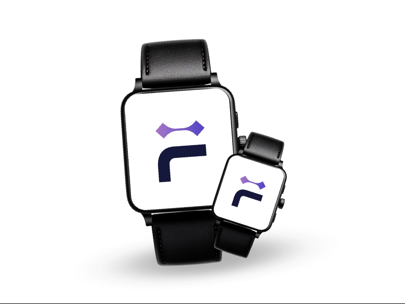
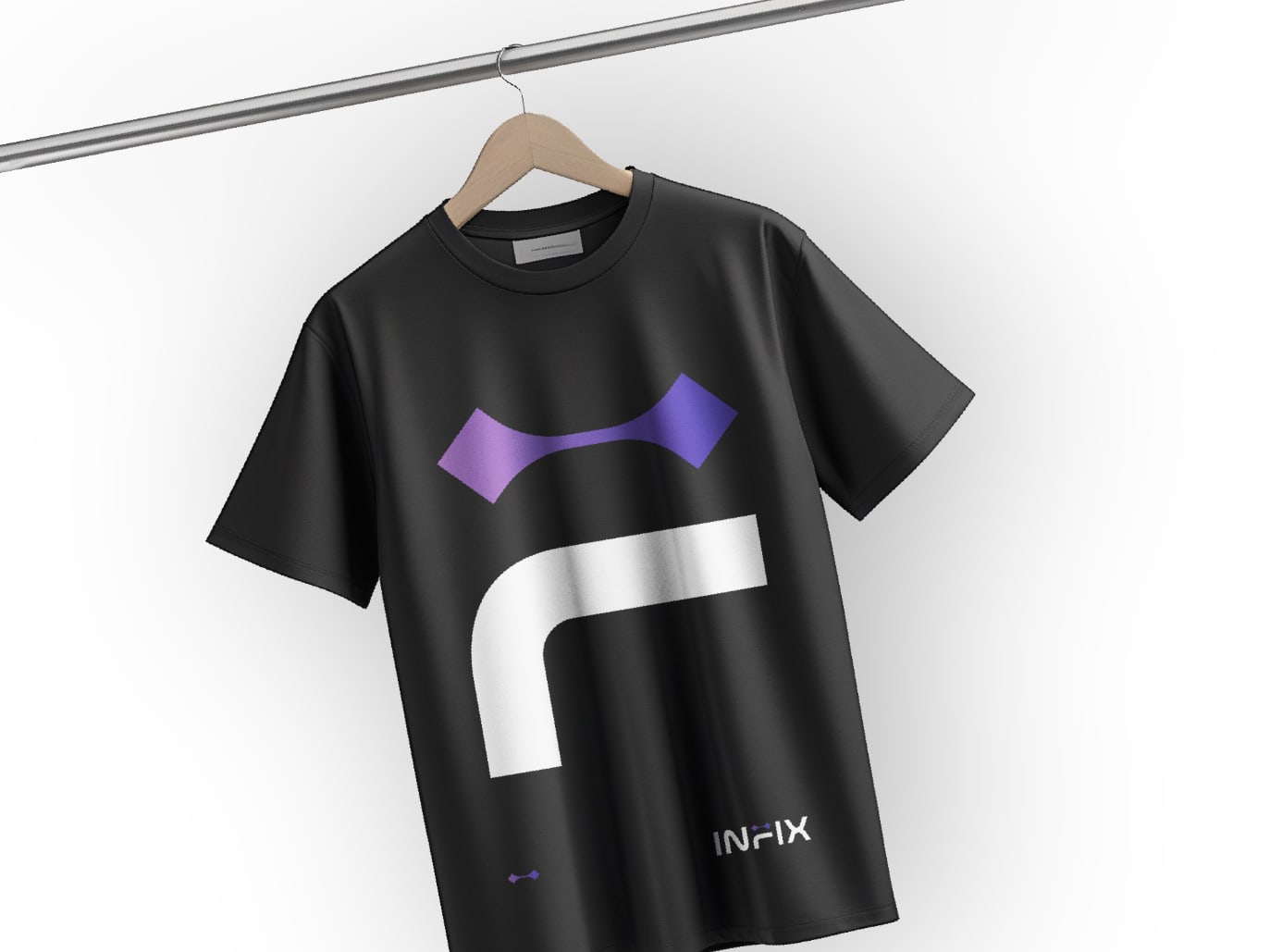
Business cards with a scannable code, a machined badge, a watch face, and apparel. Infrastructure companies win work through relationships, so the identity had to survive being handed over and worn.
What was delivered
The set


What we are not claiming: no engagement or revenue figures, because we cannot show you a source for them on this engagement. Judge this on the work and on whether the set holds together as one brand. Why we work that way.
Graphic Design
Brand identities, pitch decks, social kits, and print built as a system rather than a one off file. Editable source delivered, IP assigned on payment.
The thinking behind it
More work
Need a set like this?
Tell us what you sell and who buys it. You get a fixed scope quote within 48 hours.
Start a project