Logo, Identity, and Website for a Global Recruiter
Recruitment has no product to photograph, so the identity is the product. A monogram, a full logo system, and the website it had to survive contact with.
- Client
- Lumina Talent Advisory
- Sector
- Talent and recruitment consulting
- Discipline
- Graphic design
The brief
Lumina Talent Advisory places professionals with organisations across several industries, in a market where the competition is enormous and largely undifferentiated. There is no product to photograph and no feature list to compare. What a client is buying is judgement, and judgement is communicated almost entirely through how a firm presents itself.
So the identity had to do two contradictory things at once: look established enough that a corporate HR director will take a first meeting, and look current enough that a candidate in their thirties does not assume the firm is a decade behind.
The decisions
- 01
A monogram that behaves like an institution
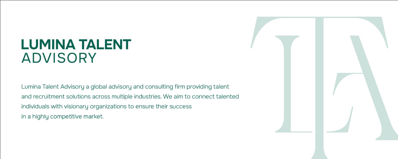
An interlocked TA built from a high contrast serif. Serif letterforms read as considered and permanent, which is exactly the association a firm asking you to trust it with hiring decisions needs to borrow.
- 02
Green, not consultancy blue
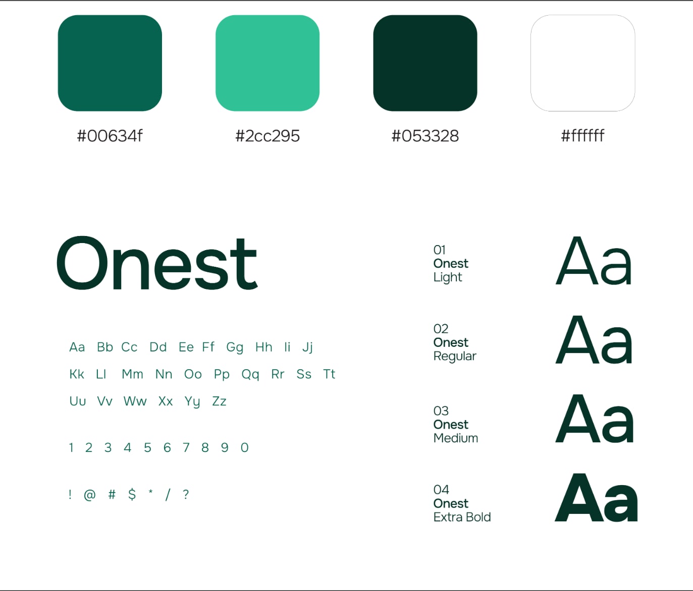
Deep green (#00634f) with a bright accent (#2cc295) and a near black green (#053328). Blue is the default for professional services, which makes it invisible. Green keeps the credibility and carries growth without the tech startup connotation.
- 03
One typeface, four weights
Onest across Light, Regular, Medium, and Extra Bold. A single family with a real weight range beats a clever pairing when documents will be produced by non designers for years afterwards.
- 04
Three lockups, so nobody improvises
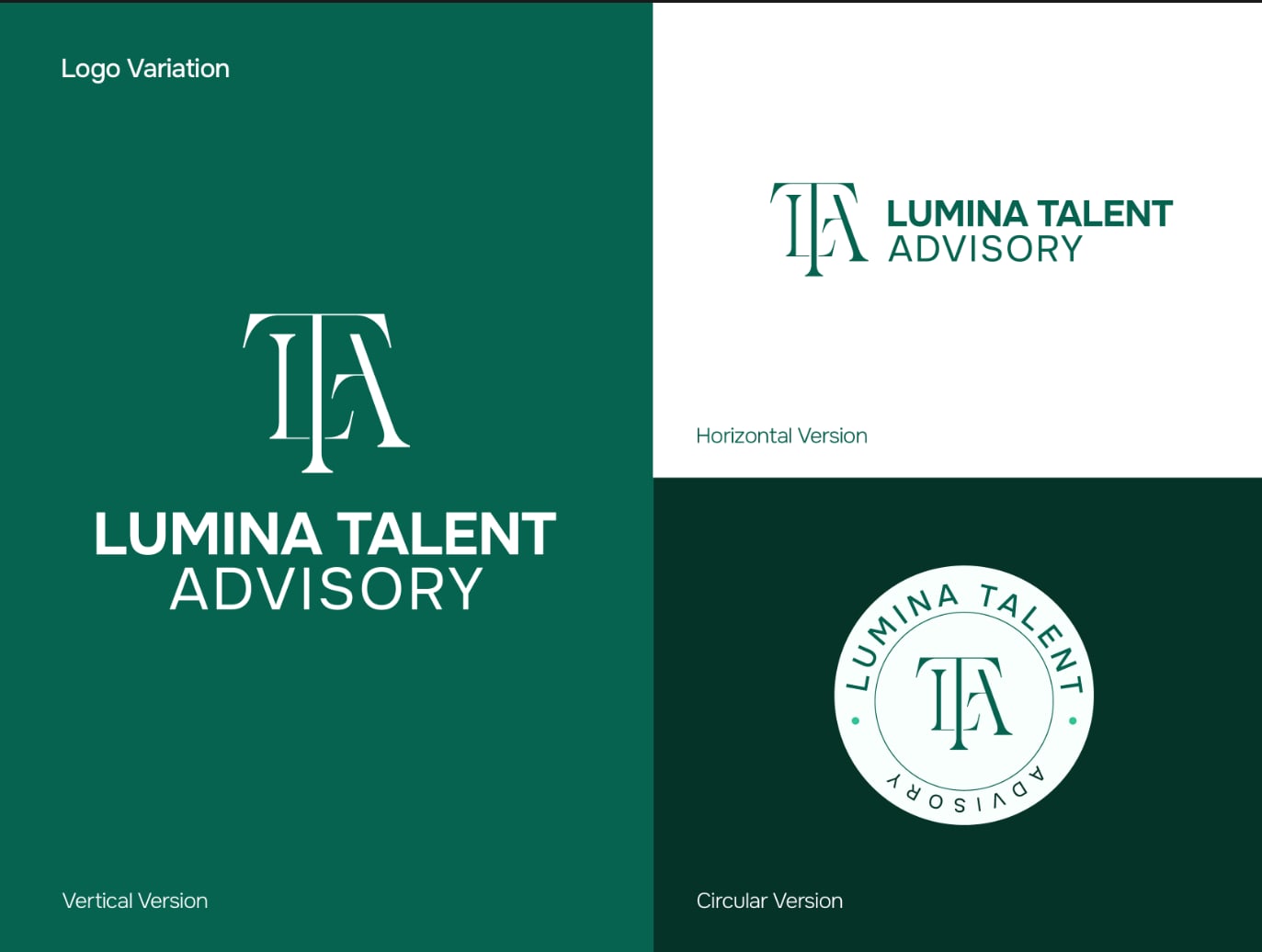
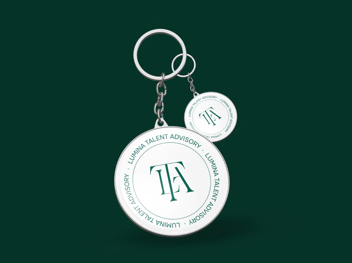
Horizontal, vertical, and circular versions delivered as part of the system. Most identities break the first time someone needs a square avatar and stretches the wrong file.
- 05
Proved on the boring surfaces
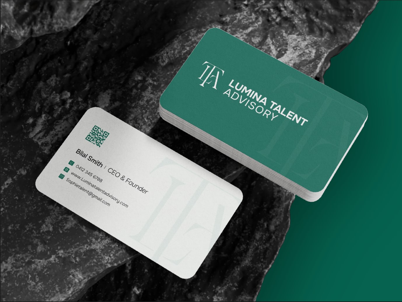
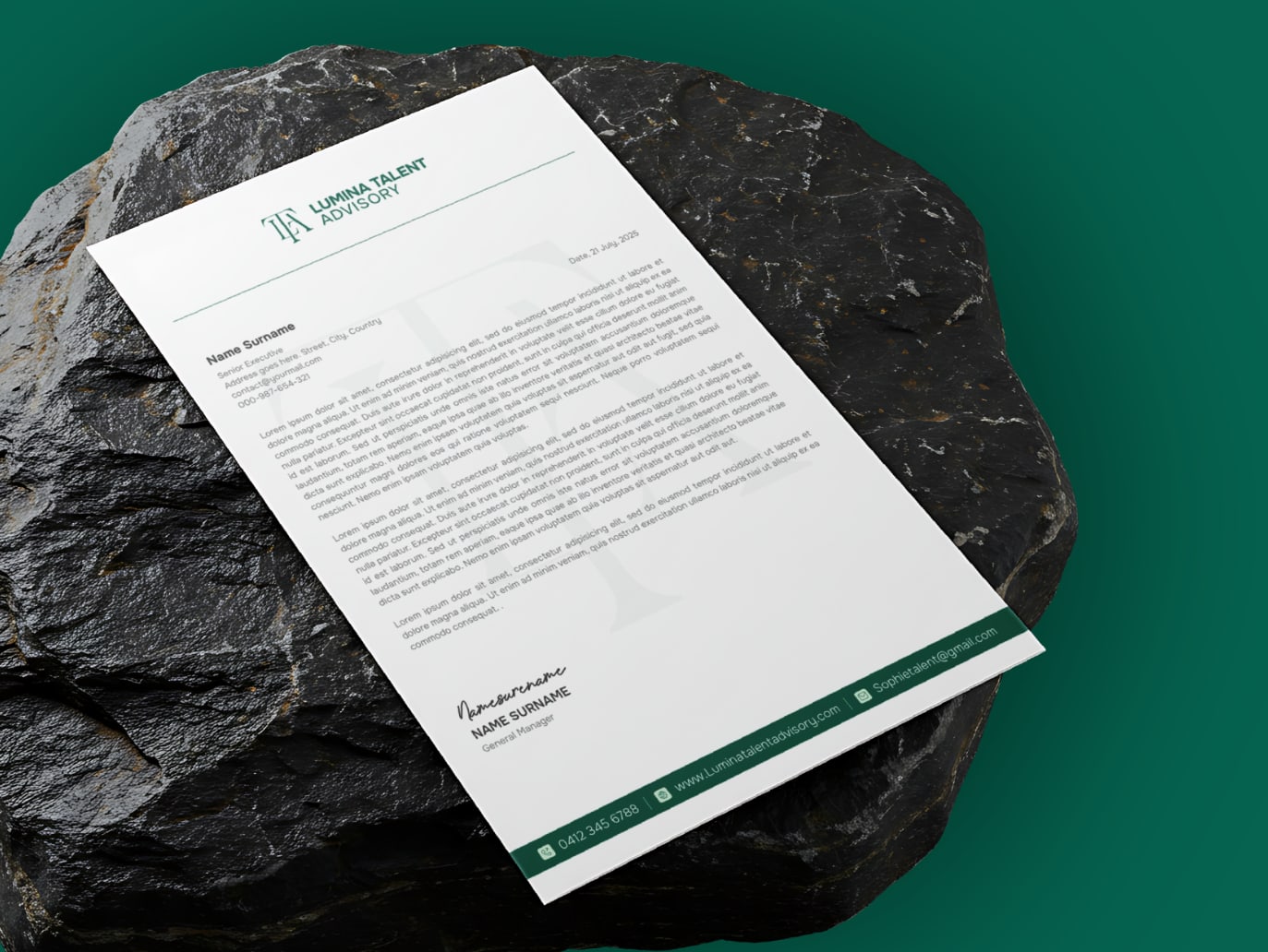
Letterhead, business cards with a scannable QR, and a keychain. An identity that only works on a title slide is not finished. The test is whether it survives an A4 document and a two inch card.
- 06
Carried through to the website
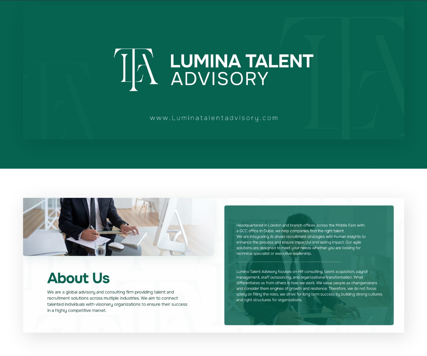
About, services, industry specialisations, and team pages designed in the same system, so the brand does not reset at the domain. The site is where the credibility built by the identity is either confirmed or lost.
- 07
A film that states a position, not a service list
Forty seconds of kinetic type over footage, built as a pair of negations before an assertion: not just talent, not just business, it is transformation. A recruitment film that opens by listing services is indistinguishable from every other recruitment film.
What was delivered
The brand film
Forty seconds for the top of the website. Kinetic type in the brand typeface, cut over footage, building to the line the firm wants remembered. No voiceover, because it has to work in a muted feed as well as on the site.
Read the on screen copy40 seconds
Not just talent.
Not just business.
Partnership.
Leap. Pivot. Growth.
Rise together.
Listening, deeply.
Hearts. Mission. Vision. Skills.
Fueled by data.
Informed by insights.
Driven by strategy.
Inspired by humanity.
Cultures. Teams. Future.
And for what comes next: you, us.
It is more than hiring.
It is transformation.
Lumina Talent Advisory.
The set

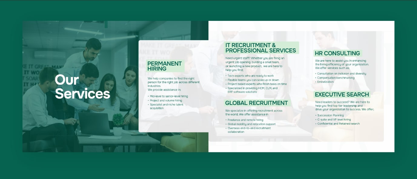
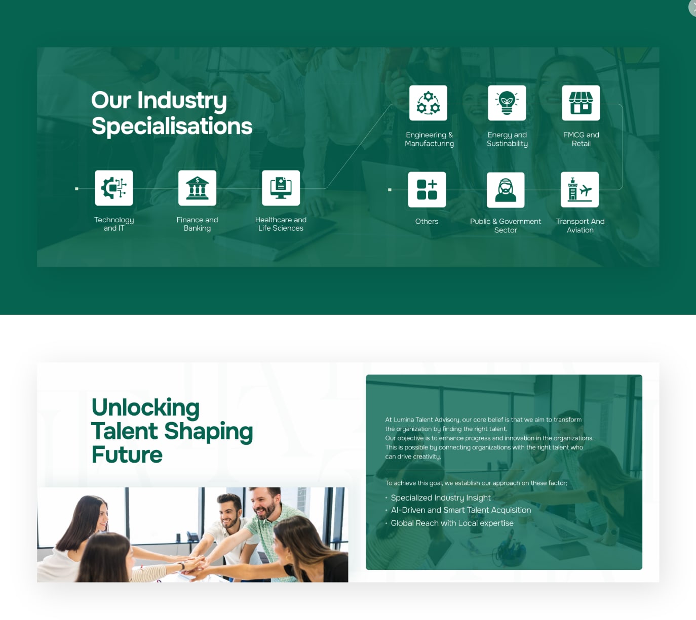
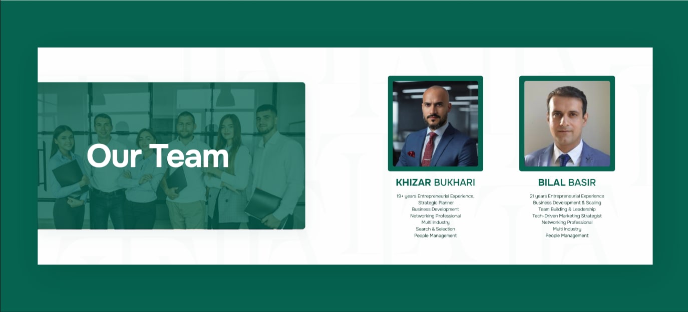
What we are not claiming: no engagement or revenue figures, because we cannot show you a source for them on this engagement. Judge this on the work and on whether the set holds together as one brand. Why we work that way.
Graphic Design
Brand identities, pitch decks, social kits, and print built as a system rather than a one off file. Editable source delivered, IP assigned on payment.
The thinking behind it
More work
Need a set like this?
Tell us what you sell and who buys it. You get a fixed scope quote within 48 hours.
Start a project